def visualize_trip_distance_over_something(metric, metric_name, df_1, df_2=None, description_1="", description_2="", min_factor=0.99):
def specific_chart(df, description_bonus):
min_value = df['avg_distance_km'].min() * min_factor
max_value = df['avg_distance_km'].max() * 1.02
return alt.Chart(df).mark_bar().encode(
x=alt.X(metric, title=metric_name, sort=None),
y=alt.Y('avg_distance_km:Q', title='Average distance (km)',
scale=alt.Scale(domain=(min_value, max_value))),
color=alt.Color(metric, title=metric_name),
tooltip=['avg_distance_km', metric]
).properties(
title= f'Average trip distance per {metric_name} {description_bonus}',
width= 250,
height= 200
)
if df_2 is None:
chart = alt.hconcat(specific_chart(df_1, description_1))
else :
chart = alt.hconcat(
specific_chart(df_1, description_1),
specific_chart(df_2, description_2)
)
chart = chart.configure_axis(
labelAngle=45,
titleFontSize=12,
labelFontSize=10,
labelOverlap='parity'
).configure_legend(
titleFontSize=12,
labelFontSize=10
)
return chart
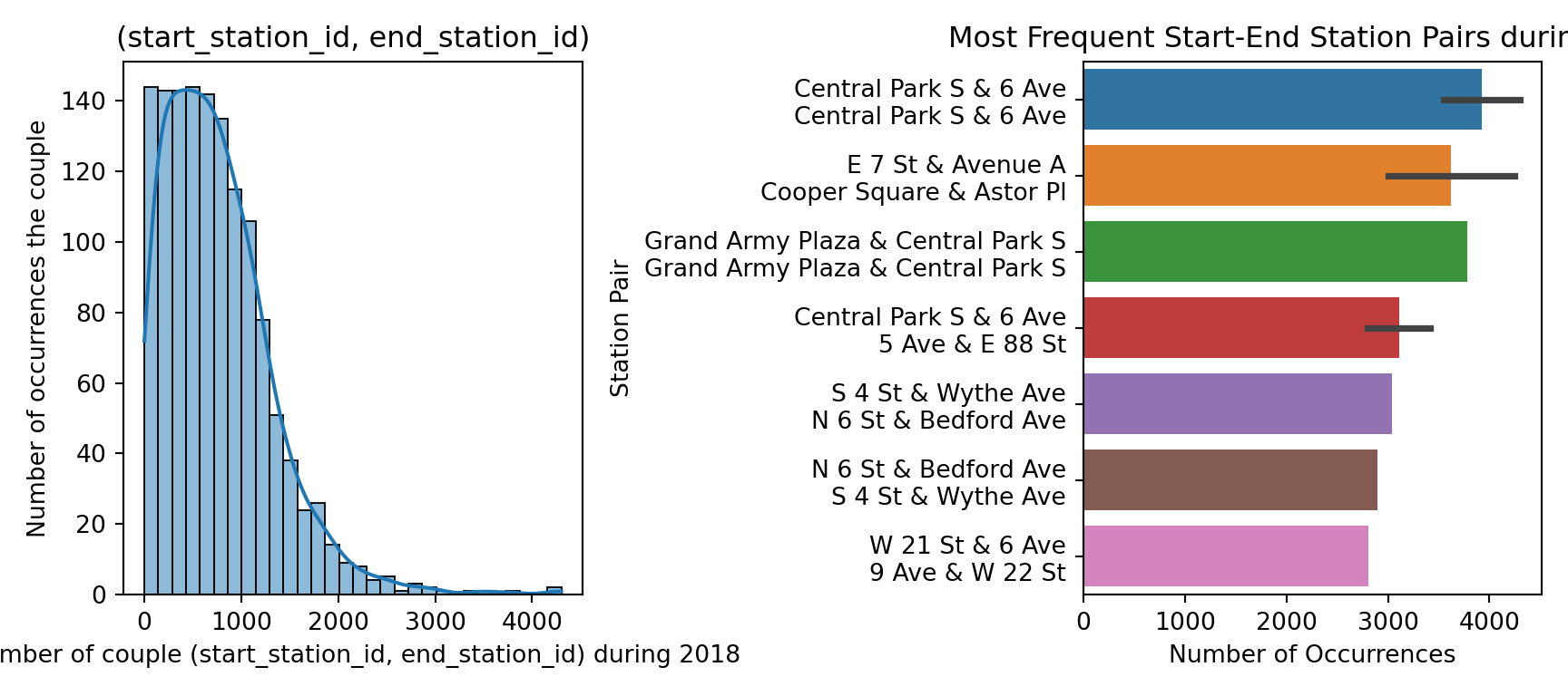
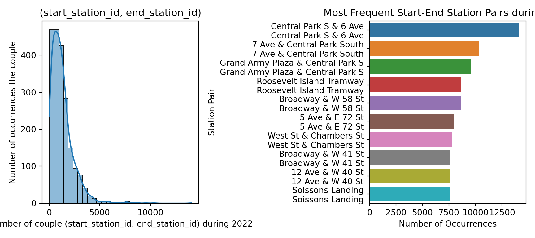
def visualize_number_of_pickup_drop(ax, df, date):
sns.histplot(df["count"], bins=30, kde=True, ax=ax)
ax.set_xlabel("Number of couple (start_station_id, end_station_id) during " + date)
ax.set_ylabel("Number of occurrences the couple")
ax.set_title("(start_station_id, end_station_id)")
def visualize_top_10_pickup_dropoff(ax, top_10_df, date):
sns.barplot(x="count", y="station_pair", data=top_10_df, dodge=False, ax=ax)
ax.set_xlabel("Number of Occurrences")
ax.set_ylabel("Station Pair")
ax.set_title("Most Frequent Start-End Station Pairs during " + date)
labels = [item.get_text() for item in ax.get_yticklabels()]
wrapped_labels = ["\n".join(label.split(" -> ")) for label in labels]
ax.set_yticklabels(wrapped_labels)
def full_visualization(df_reduce_pickup_dropoff, df_top_10_pickup_dropoff, date):
fig, axes = plt.subplots(1, 2, figsize=(9, 4))
visualize_number_of_pickup_drop(axes[0], df_reduce_pickup_dropoff, date)
visualize_top_10_pickup_dropoff(axes[1], df_top_10_pickup_dropoff, date)
plt.tight_layout()
plt.show()
def full_visualization_over_the_week(metric, metric_name, df_1, df_2, description_1="", description_2=""):
def specific_chart(df, description_bonus):
min_value = 0 # df['avg_distance_km'].min() * 0.80
max_value = df['avg_distance_km'].max() * 1.02
return alt.Chart(df).mark_bar().encode(
x=alt.X('hour_of_the_week:N', title='Hour of the week', sort=None),
y=alt.Y(metric, title=metric_name), #scale=alt.Scale(domain=(min_value, max_value))),
color=alt.Color('day_of_the_week', title='Day of the week'),
tooltip=[metric, 'day_of_the_week', 'hour_of_the_day']
).properties(
title= f'{metric_name} per hour of the week ' + description_bonus,
width= 250,
height= 200
)
chart = alt.hconcat(
specific_chart(df_1, description_1),
specific_chart(df_2, description_2)
).configure_axis(
labelAngle=45
)
chart = chart.configure_axis(
titleFontSize=12,
labelFontSize=10,
labelOverlap='parity'
).configure_legend(
titleFontSize=12,
labelFontSize=10
)
return chart
full_visualization_over_the_week_1822 = lambda x, y : full_visualization_over_the_week(x, y, data_phw_2018, data_phw_2022, "(2018)", "(2022)")